
Introduction: Why Does Your Dining Room Still Feel Like a "Cheap Rental"?
You’ve likely done everything in your power to escape that "temporary living" vibe. You’ve invested in a solid wood dining table, laid down a textured linen rug, and perhaps even curated a small gallery wall of your favorite prints. Yet, there is a recurring frustration: the moment the sun sets and you flick the switch, the space instantly reverts to that flat, uninspired, "cookie-cutter apartment" look.
This sense of visual defeat rarely stems from your furniture. Instead, it’s usually caused by a lack of depth in light and color.
In most standardized apartments or rushed renovations, the ceiling is often treated as an afterthought—either left to a sterile, flush-mount fixture or a generic, plastic-heavy pendant that lacks character. These lights emit a flat, diffused glow that effectively washes out the room, erasing the nuances of your interior. Under this light, your expensive dinnerware looks dull, your wall paint appears muddy, and even a home-cooked meal loses its vibrant, inviting appeal.
The essence of a "cheap" aesthetic is visual flatness. When a room lacks an "anchor"—a focal point that commands attention and introduces a deliberate color personality—your furniture ceases to look like a curated collection and starts looking like a random assembly of objects.
For those who view their home as a reflection of their identity, the dining room is more than just a place to eat; it is the emotional heart of the home. The lamp you are searching for shouldn't just illuminate your table; it should be a declaration of your design sovereignty. It needs to fight back against industrial coldness through high-end textures, structural integrity, and a color palette that actually "talks" to the rest of your decor.
To truly banish the "rental vibe," the first step is breaking the stalemate of a pale, colorless ceiling. In the following sections, we will explore how the precise application of color and the layering of light can transform a simple pendant into the ultimate "aesthetic savior" of your dining space.
Color Narrative: How Macaron Tones Redefine Appetite and Sophistication
When people hear the word "colorful" in interior design, they often recoil, fearing a space that feels juvenile or "kitsch." There is a fine line between a vibrant, designer home and a playroom. To avoid the "cheap apartment" trap, the secret lies in the saturation and finish of the colors you choose.
This is where the concept of a Color Narrative comes in. Instead of using high-gloss, primary reds or yellows that scream for attention, sophisticated dining spaces utilize "muted vibrance." Think of the soft, powdery hues of a Parisian patisserie—shades like sage green, dusty rose, and pale azure. These aren't just colors; they are atmospheric tools that stimulate the appetite while soothing the eyes.
The Nordic Macaron Rainbow Metal Pendant Lamp (N52) masters this balance through its deliberate use of matte textures. By applying a refined, frosted finish to a "Rainbow" palette, the N52 strips away the garishness of typical colored plastic. The metal provides a weight and permanence that plastic lacks, while the matte coating absorbs light just enough to create a soft, velvety glow on the lamp’s surface.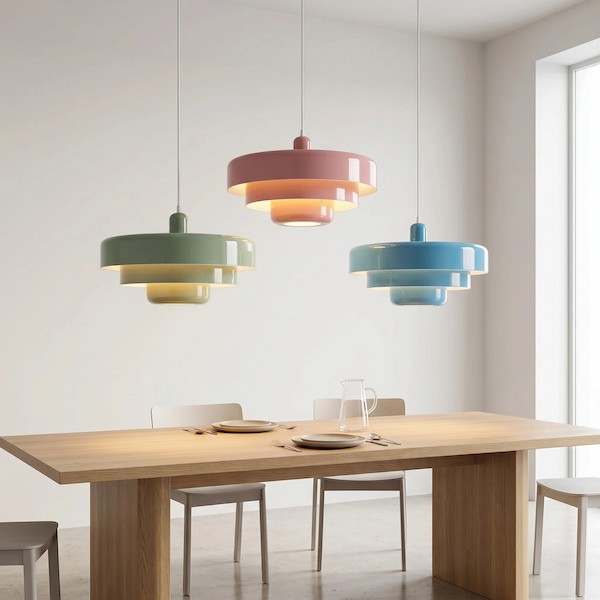
But the real magic happens in the multi-lamp narrative. In a high-end restaurant, you rarely see a single solitary bulb. By grouping three or five N52 lamps in different macaron shades over your dining table, you create a visual rhythm. One lamp might echo the green of a nearby houseplant, while another picks up the subtle grey of your chair upholstery. This "Rainbow" effect isn't childish; it’s a sophisticated layering technique that ties disparate furniture pieces together into a singular, intentional design story.
Instead of a room that feels empty and "white," you now have a ceiling that provides a soft, colorful canopy—one that tells your guests this space was curated by someone who isn't afraid to play with light, yet knows exactly where the boundary of elegance lies. To achieve this, many designers recommend starting with a macaron rainbow pendant lamp to set the tone.
2.The Power of Form: Breaking Flatness with Organic and Geometric Shapes
Color can set the mood, but form is what gives a room its soul. If your dining area still feels like a generic box despite a new coat of paint, it’s likely because the space lacks "sculptural tension." In professional interior design, the most direct way to shatter the monotony of four flat walls is to introduce a ceiling fixture that doubles as a piece of art.
The struggle with many standard homes is that everything—from the windows to the cabinets—follows a rigid, linear grid. To create a space that feels bespoke, you must decide whether to lean into that architectural precision or to rebel against it with soft, natural curves.
The Organic Rebellion: Softening the Edges
If your furniture consists of sharp angles and cold surfaces, an organic silhouette can breathe life into the room. This is the design philosophy behind the Lámpara colgante Blossenari Nordic Flower Design (N34). By mimicking the delicate, layered petals of a blooming flower, the N34 acts as a "soft anchor."
Unlike a flat light source, its floral, sculptural flower pendant light form creates a complex interplay of light and shadow. As the light filters through its "petals," it adds a sense of organic movement to the ceiling. This layered texture prevents the room from feeling "flat" and introduces a romantic, high-end sensibility that makes the ceiling feel like a gallery space rather than just a utility surface.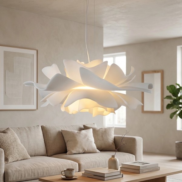
The Geometric Statement: Defining Modern Authority
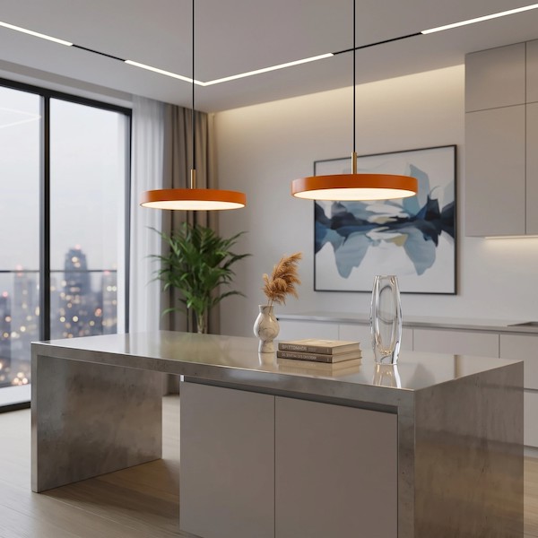
Conversely, some spaces require the strength of clean, mathematical lines to establish order and modern sophistication. This is where a geometric approach excels. A piece like the Lámpara colgante geométrica Astris uses metal frames to "draw" in the air, creating a transparent yet bold presence over a kitchen island or dining table.
The beauty of a sleek geometric pendant lies in its transparency; it provides a strong visual structure without blocking the sightlines of your home. The Astris lamp doesn't just hang; it frames the air around it, adding a sense of architectural deliberate-ness that is the hallmark of a custom-designed home.
Creating the "High-Low" Contrast
The most sophisticated restaurants often mix these two principles. By pairing the soft, petal-like curves of the Blossenari (N34) in the living area with the structured, metal precision of the Astris over the nearby kitchen island, you create a visual dialogue. This contrast between "Organic" and "Geometric" signals to anyone walking in that this isn't a temporary apartment—it is a thought-out environment where every shape has been chosen to provide a three-dimensional experience.
3.The Alchemy of Light and Texture: Balancing Color Temperature with Material Finish
Choosing the perfect color and shape for your pendant light is only half the battle. The final "designer touch" that separates a high-end restaurant from a lackluster apartment is the technical relationship between the bulb’s light and the lamp’s material. If you’ve ever bought a beautiful colored lamp only to find it looks "muddy" or "cheap" once turned on, you’ve likely experienced a mismatch in Color Temperature and Rendering.
To make the colors of your dining room truly sing, you must understand how light interacts with surfaces.
- The CRI Secret: Bringing Colors to Life
In professional lighting design, we prioritize the Color Rendering Index (CRI). A low CRI light source will make the vibrant macaron shades of a lamp look grey and lifeless. To ensure your dinner—and your decor—looks as rich as intended, always opt for bulbs with a CRI of 90 or higher. This ensures that the soft azure or dusty rose of your fixture remains true to its designer intent, even after the sun goes down. - Warmth vs. Metal: The Texture Interaction
The material of your pendant light acts as a filter for the atmosphere. This is particularly evident with the Nordic Macaron Rainbow Metal Pendant Lamp (N52). Because the N52 is crafted from high-quality metal with a specialized matte-frosted finish, it reacts uniquely to different light temperatures.
Warm White (2700K - 3000K): This is the "Golden Hour" for your restaurant. Warm light softens the metal’s edge and deepens the macaron tones, creating a cozy, intimate glow. It makes the matte surface of the N52 feel velvety and tactile, perfect for long dinners and conversation.
Neutral White (3500K - 4000K): If your dining room also serves as a workspace or a bright breakfast nook, neutral light brings out the "Rainbow" crispness. It highlights the precision of the metal craftsmanship and keeps the colors looking energetic and modern. This balance is often explored when evaluating 【辅文1】macaron vs geometric pendants in different settings, or even when planning 【辅文2】lighting layouts for creative offices.
Avoid the "Fluorescent Trap": The biggest mistake that leads to a "cheap rental" feel is using cool, blue-toned light (5000K+). This harsh light flattens the frosted texture of metal lamps and turns sophisticated macaron hues into sickly, clinical shades.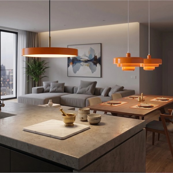
4.Practical Guide: Achieving Visual Continuity from Table to Living Room
One of the most common pitfalls in modern home design—especially in open-plan layouts—is the "island effect." This happens when the dining area and the living room feel like two completely different worlds, separated by a sudden, jarring shift in style. To truly banish the "cheap apartment" vibe, you must look beyond the dining table and consider the visual thread that connects your entire living space.
Achieving a cohesive "color sense" doesn't mean everything has to match perfectly; it means your lighting choices should speak the same language.
The "Echo" Strategy: Linking Spaces Through Color and Material
If you’ve chosen the Nordic Macaron Rainbow (N52) as your dining centerpiece, you’ve already introduced a sophisticated palette of muted tones and matte metal. To prevent this from feeling like an isolated "pop of color," you need to "echo" these elements in the adjacent living room.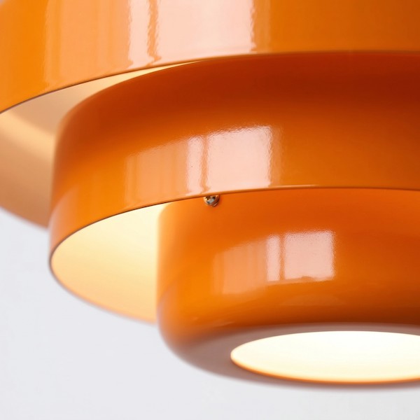
- Color Echoing: If your N52 features a sage green or dusty blue shade, look for a secondary light source or accessory in the living area that shares that same tonal family.
- Material Harmony: Since the N52 and the Astris Geometric Pendant both utilize high-grade metal finishes, using them in adjacent zones creates a material "bridge." The structured lines of the Astris over a kitchen bar can act as a modern counterpoint to the softer macaron colors of the N52 over the dining table, signaling a unified design intent.
The Rule of Three: Balancing Proportion and Style
When mixing different sculptural forms—like the organic Blossenari Nordic Flower (N34) and the linear Astris—follow the "Rule of Three" regarding visual weight.
- Select a Hero: Let one piece be the dominant "sculpture" (e.g., the floral N34 in the living room).
- Select a Support: Use the second piece to provide contrast (e.g., the geometric Astris in the transition zone).
- Unify with Light: Ensure all pieces use the same color temperature (as discussed in the previous section) to create a seamless glow that flows from one room to the next.
FAQ
How do I choose a pendant light color that doesn't look cheap?
Opt for matte finishes and muted "macaron" tones rather than high-gloss primary colors. Materials like metal with a frosted coating provide a high-end, sophisticated feel.
What is the best light temperature for a dining room?
Warm white (2700K - 3000K) is ideal for creating an intimate, restaurant-like atmosphere that enhances the warmth of metal textures.
Where can I find a complete statement pendant light guide?
We recommend looking for guides that focus on layering light (ambient, task, and accent) rather than just choosing one fixture.
Creating a Curated Journey
In an open-concept home, your eyes should travel effortlessly from the soft, petal-like layers of the Blossenari to the playful, matte-finished Rainbow N52. This transition is what makes a home feel "bespoke." By mixing these pieces—choosing the Astris for its architectural strength, the N52 for its color narrative, and the N34 for its organic elegance—you aren't just buying lamps; you are building a professional-grade interior landscape.
This holistic approach ensures that your home never feels like a collection of "standard" furniture. Instead, it feels like a high-end restaurant where the lighting has been meticulously choreographed to enhance every color, every texture, and every moment spent within its walls.
